šŸ’¬ New Trakt Feedback

Unfortunate to say my 5 years of VIP are done for, I was thinking of doing the 2 years, but I want features over UI.

If something works great, why do you need to go and re-design it entirely to be waaay different and without a lot of the useful features? I also found the toggle for spoilers, but I very much preferred the way classic does it, aka blurs it and you can click on it if you want to see.

The profile page does feel very very bare. Where’s the ratings or anything one has done on trakt previously?

10 Likes

And other issue. Whenever I mark something as ā€˜watched’ on the iOS app, it’s still showing in the calender for classic Trakt. (I have a filter to hide watched shows). The only way to fix it is to reset my data on the advanced settings everytime I look at it. I thought the whole idea of this is that everything all worked together…..

Unless they are co-ordinating their responses with @justin . It’s only just gone 9am in San Diego.

2 Likes

I am mainly an iOS app user and I took a look at the beta 3.0 build that was recently released on TestFlight. I was speechless when I saw how horrendous the changes were…

What in the world happened! There are so many features missing I can’t believe this is the direction of the new redesign. The episode detail page is the biggest offense. The choice to show the series poster instead of individual thumbnails is awful because it makes it harder to differentiate between each episode. Putting everything other than the synopsis in a hidden tab that requires tapping an extra button is just terrible ux design. Why is the where to watch block taking up a whole section! If anything needs to be hidden it’s that.

Actors aren’t separated by season regular/guest stars anymore. Actor pages don’t show ā€œfrom your historyā€ section which is a huge downgrade for me since I use that all the time. When I see a familiar face in a show I want to know what previous series I recognize them from.

Can’t collapse comments anymore. Can’t scroll horizontally between episodes. Can’t click on writer or director names. Have to dig through two sub menus to add a note instead of just clicking one button. Horizontal scrolling is obnoxious for shows that have 20+ episodes per season. The vertical version was superior in every way.

Trying to view a season overview page is hilarious because the you have to long press the poster icon and select ā€œOldā€ on the drop down list and it takes you to the legacy layout version :sob: like just give us an old option toggle for the entire app at this point.

I’m not even going to begin to get into all the mess of the website issues. My main focus is on the app because iOS doesn’t work like android or the web. We don’t have the option to downgrade or use an old link address to use the classic version. Once this build gets pushed to the main App Store that’s it. Of course there’s the ā€˜just don’t update your app’ type of response but that only works for so long. Until something breaks and an update is required to fix a bug, or a new feature comes out that I really want to use, or corporate decides to server side block older app versions and force users to update to the latest.

I’ve read through all the replies in this thread and I really hope management does the same and actually considers this feedback. NO ONE WANTS THIS. Users across all platforms are saying one way or another that these changes are downgrades. Stop trying to fix what’s not broken. As I read in another reply the purple icon rebrand really was the beginning of the end :frowning:

19 Likes

I fully agree with the things you said. I really don’t like that you can only see the series posters on each episode. And you can only see the series regular actor on episode and not the guest stars anymore.

And just like you i also used the ā€œFrom your historyā€ feature a lot. I hope they bring this feature back.

They should have waited with the update until it’s more polished and not like this, with half the features the userbase uses and pays for.

3 Likes

Honestly, I like most of this new UI in concept, it’s modern and clean

But it’s literally unusable currently


Literally none of the rows on any page have a arrow button to scroll the row (no matter how much you hover over the end of the row), meaning you can’t view anything off screen. For sections like the above, okay you just click the button to go to the full page with the vertical list, no big deal right?


Seasons and Episodes literally don’t have that button so you can only see as wide as your monitor (and keep in mind! I have a 21:9 ultrawide and this is fullscreened so I can see WAY more than most people), it’s literally impossible to view anything past a certain season/episode number to mark it as watched, how did this get released with such basic functionality broken

4 Likes

You have to use the invisible scroll bar which only shows up when you hover over it…

1 Like

How do I stop the popup box trying to prompt me to rate my latest watched movie from remaining persistent across screens?

I have never rated anything through Trakt so it shouldn’t be appearing. Any rating I have is imported from other services. But regardless, the box shouldn’t be a persistent nag.

I can’t tell whether you are joking or whether you really have one. I can categorically guarantee there isn’t one visible on my web browser.

ETA. Maybe you could go to the series The Following ( Trakt Web: Track Your Shows & Movies ) which has 15 episodes per season of which only 8 are visible and record or send a screenshot of this invisible scroll bar that should appear somewhere.

1 Like

Unfortunately I’m not kidding.

4 Likes

How do you scroll lists left and right on a pc? Theres no left or right arrows, you can’t drag it left and right and scroll wheel doesn’t do anything either!

2 Likes

Hover your mouse under the list until you find the invisible scroll bar ….

2 Likes

I would give feedback for this ā€œNew Traktā€ but I unfortunately don’t have the hours to spare in order to type out all the things I hate about it and how much is missing from the previous design.

All I’ll say is, as a 10+ year VIP who has still stuck with you guys through the doubled price increase, if you ever get rid of Trakt Classic, I’m DONE.

20 Likes

WTF is this minimalistic POS? Are you serious? This is the new Trakt, and the classic is DEAD?

Are you hellbent on destroying literally everything that made Tratkt good? If you aren’t the most anti-consumer service right now, I can’t imagine how bad others must be.

If I wanted to use an app made for children who have never used an actual PC browser with mouse and keyboard, I wouldn’t be paying you a subscription.

18 Likes

Not even gonna try to explain why literally everything about it is awful. I hate infinite scroll mode over pagination SOOOOOOOOOO much. And now I can’t order my lists by release like I did literally 4 days ago?

Nah man, I already canceled my VIP subscription before posting this. GTFO with this bs.

11 Likes

The scroll bar isn’t appearing when I hover over the bottom of the row either

3 Likes

to help with anyone not seeing the scroll bar. hold shift over the row you want to navigate then you can use your scroll wheel to scroll horizontally. this works nearly anywhere in any application btw.

Is that ideal, no. I’m just trying to help

5 Likes

I saw this announcement on Sunday and it instantly ruined my mood. First you piss away many of the OG trakt users with the VIP changes, and now you want to bury the usability of the site for good to make this just another ā€œappā€ā€¦

Good to see that many people are voicing their very fair criticisms of Lite at last. Personally I did that twice before months ago and to no surprise things are not much better or fixed The why & what - #8 by sp1ti - starting with almost crashing my browser when visiting a movie… unstable and barely unusable product. great job!

Lets stop writing AI summaries about how great it is and try actually using the thing first.

Seeing as communication stopped on this new & fresh announcement I’m gonna go doom some more.

I’ll leave you with a quote from your own dev about the readiness of this one:

9 Likes

I have found the invisible scroll bar now as well. But after trying the shift-scrolling as mentioned by @otakunet21 , which by the way was extremely jittery for me, the scroll bar disappeared and only reappeared after refreshing the page.

1 Like

Hey everyone :waving_hand:

Thank you to all of you who took the time to share feedback. We have read through this full thread (and more) and want to reflect back on what we heard and how we are acting on it.

What we heard

Here are the main themes that came through clearly:

  1. The New Trakt should not feel like a step back from Classic.
    Some of the core things many of you do every day feel more limited today and you want to keep the clarity and efficiency you had in Classic.
  2. The desktop experience needs more attention.
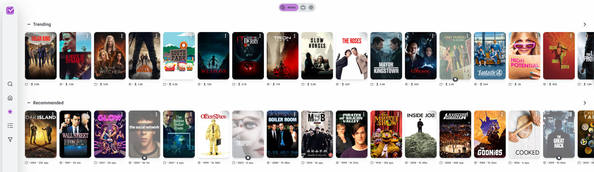
    Horizontal scrolling is causing friction and does not match how many of you browse, manage or track your shows and movies on desktop.
  3. The new experience needs to support more workflows.
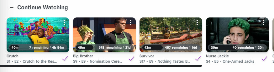
    It must remain easy to track progress, review history, organize what to watch, rate meaningfully, sort and filter, plan ahead and understand your viewing habits.

What we are focusing on next

Your feedback is directly shaping our priorities. Here is where we are putting our focus over the next couple of months:

Support and improve core workflows

We are not just copying Classic as it is. The new experience will continue to evolve to support the core things you do in Trakt every day, including:

  • Tracking what you watched and what is next
  • Reviewing and editing your history
  • Organizing what you plan to watch and your library
  • Rating with the level of detail and meaning you expect
  • Sorting and filtering to find the right content fast
  • Seeing what is coming up in a way that works for you
  • Understanding your profile, stats and habits at a deeper level

These workflows will return stronger, not disappear.

Improving the desktop browsing experience

We hear the feedback about navigation. We are exploring improvements and options to make desktop use more intuitive and comfortable. Our aim is to deliver meaningful improvements within the same timeframe as the workflow updates above.

We know some of you are worried and frustrated. We take this seriously. Our goal is not to change what makes Trakt special. Our goal is to build on it so Trakt continues to serve you well for many years to come. And we want to make this transition with you, not to you.

A Quick Note on Community Guidelines

Before sharing more context about the strategy and the data behind it, we want to make sure this discussion remains helpful and welcoming for everyone taking part.

Most feedback in this thread has been respectful, thoughtful and constructive, and we appreciate it. A small part, however, crossed the lines we set for this community. To keep the forum supportive, focused and inclusive, please take a moment to review the Trakt Forum Guidelines.

A few key reminders:

  • Respect, kindness and inclusion are non-negotiable. We welcome all feedback but personal attacks or hostile language do not help anyone.
  • Promoting other services is not allowed here. This forum is for Trakt and its ecosystem.
  • Staying on topic helps us understand your feedback and act on it faster.

We absolutely welcome strong opinions and critical feedback. It helps us improve. We only ask that it stays respectful, focused and within the guidelines so everyone feels comfortable contributing.

Additional Context

Some of you asked for more context about why we are evolving Trakt and how the new experience fits into the long term vision.

Here are a few useful facts first:

  • Trakt Classic has been around for more than 10 years, with most of its history focused on the desktop web.
  • The new web experience has been in development for about 1 year, with a broader focus than desktop alone.
  • About 50% of new Trakt accounts are created on the website and the other ~50% come from third-party apps.
  • Currently, more than 1000 new users are onboarded through the new experience on a daily basis!
  • All the metrics we are following are going in the right direction. For instance, our Monthly Active Users increased by 20% over last year.

Trakt has grown beyond a single website. It is a platform across web, mobile, TV and a large ecosystem of third party apps and integrations. The new experience is designed to support that future. A more modern and consistent foundation, both from a technical and a design point of view, helps us improve faster across the board, not just desktop.

We also hear long time users who use Trakt heavily on desktop. Your workflows matter! The new experience has gaps for you today. Given the size of the rebuild, the size of our team and the timeline we are on, this is expected.

We will not remove what you rely on without ensuring the new experience can meet your needs, and ideally improve them.

Thank you for caring this much

Feedback like yours is what has shaped Trakt for more than a decade. We know some of you are frustrated and we take it seriously. Our goal isn’t to change what Trakt is. It’s to strengthen the foundation so we can continue improving it for years to come, without losing what makes Trakt special.

We’ll follow up soon with updated versions of our beta on iOS and Android and updates to the new web experience, including progress in all the areas you mentioned.

Thank you again for the passion and the time you’ve invested in your feedback.
Keep it coming!

:popcorn: The Trakt Team

15 Likes

With respect, it does not seem that way. The new web experience is absolutely ā€˜barebones’ at the moment. I understand that you are building from the ground up, but isn’t it far too early to push this out as a beta?

It looks and feels like it has only been worked on a few days rather than a full year, unless of course, there are a lot more backend changes that we are not aware of and would be invisible to an end user? I’m asking out of genuine curiosity. :slightly_smiling_face:

11 Likes