💬 New Trakt Feedback

Out of curiosity, where does this leave users who actually used Trakt Lite for what it was advertised as, a streamlined basic version of Trakt without all the extras that cluttered the UI?

That was the point of Lite wasn’t it? But as you’re making Lite the new Trakt and adding back those features, you’ve just taken that away from them.

Now it’s just angered both groups, those who loved Lite and those that hate it.

18 Likes

One of the worst update I ever saw in any app. Less features, worst profile, inconsistent Ul, can’t see the director of a movie, changing the rate from 1 to 10 to 1/5 stars (how this will change my old votes?) and you can’t even vote from the app anymore ffs

Are you trying to destroy yourself?

7 Likes

I am mainly a user of the chrome browser version of trakt, but occasionally, I do use the Android app.

There are things I like about the new experience. I will say it seems to run faster than Trakt Classic. Also, I can understand that working on one version of the app would be easier on development than a website and several apps.

My biggest issues with using the New Trakt app on the web are the lack of sorting options. I tend to change from time to time, but I currently have Up Next set to sort by release date. I also like having my watchlist integrated into my Up Next, so having the ability to turn that on/off seems like an important feature. At a minimum, I would like to be able to sort in my Watchlist. The Start Watching section on the home screen is unusable, because I can’t figure out why those are the 100 watchlist items that are on top.

Additionally, there seems to be some items missing from my Continue Watching section. It seems that any items that I have watched the most recent episode, but not finished the whole series do not appear. It would be nice if we could see the entire list of Continue Watching as well.

I doubt I am the power user that some of the other people on here are, but until I have the above problems resolved, I will not be using the New Trakt experience.

2 Likes

We were at this stage before with trakt changing things without listening to feedback. Actually the last 1.5-2 years are a constant in that.

If you guys think trakt is going to listen to your feedback you are dead wrong. The redesign with the new (stupid) logo and the complete color overhaul was the beginning of the end for us heavy users. That back then set the tone and all this what is happening now was already set in motion.

I said this before - this bus is heading for the brick wall. No company ever has survived such a disservice to their OG customer base. The new generic design is for generic users. Those users won’t pay the bills though. Why would they if they can get the same hollow thing for free at the next corner when this one decides to charge all customers as soon as they figure out no VIPs are left


It’s frustrating to see. It’s frustrating that we don’t know what happened to @justin since he seemed out of the picture. It’s frustrating to get hollow or snappy answers by the product manager himself. It’s frustrating that we all poured so much love, money and effort into this project to be betrayed like this. But they will only understand if you vote with your wallet.

21 Likes

Thank you! Especially curious about metrics. :slight_smile:

1 Like

I have been used Trakt a third of my life at least once a day. This website is super important for me.

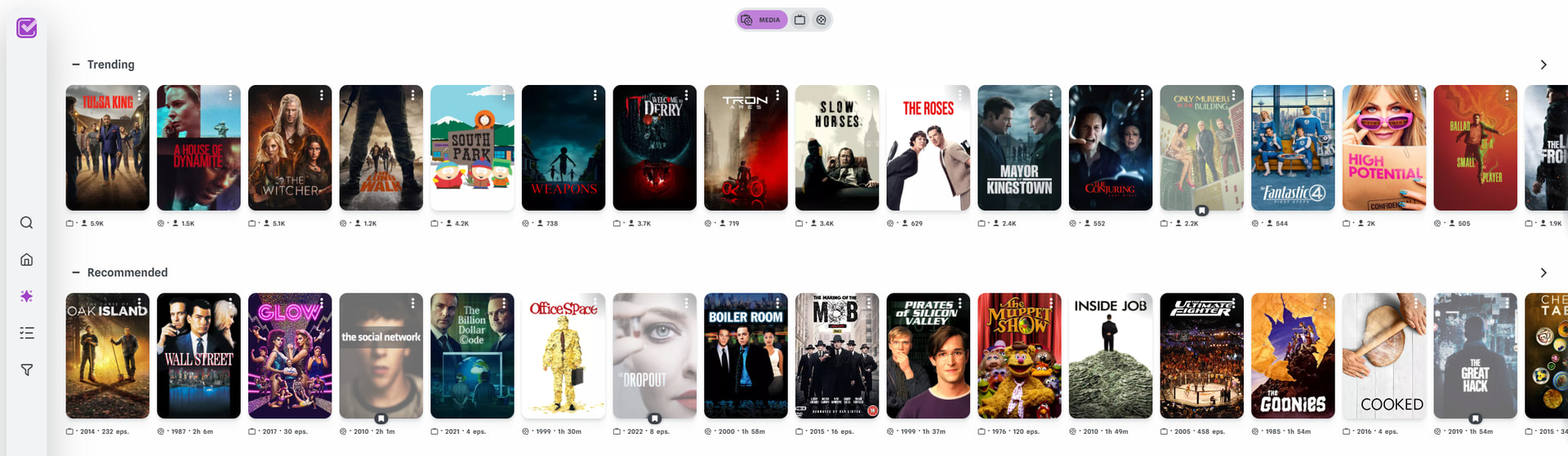
The start page is clustered. It shows what for me is uncessesary information in start watchning. The continue watching features dropped shows (on a gray scale poster) which defeats the point of dropping something.

My lists seems to be gone. As I can only see five of them (plus the watchlist). I do not know where the rest has gone.

As for the list itself is where my biggest problem lies. In the old one you could sort by rank, added date, release date, runtime, site ratings, collected/not collected etc. This function I use all the time as well as being the able to filter by your streaming services. Either a specific one or all at once. I can’t seem to find an csv-export?

The new one is missing the Last 30 Days overview which I loved to just quickly each time I open up Trakt to seee those nice bar charts over the last few days.

I also can’t find a way to see my library where I add all my blu-rays and dvds.

The ratings and genre overview also seems to be missing.

As for when I open up a film. I can only rate it out of five which is a dealbreaker for me. A 10 grade system is necessary. The Metacritic score missing (can see IMDB & Rotten Tomatoes). But the most broken feature right now is the “watch again” button. That’s the only thing I can click and it automtacilly logs the film right now. Whilst I may want to log it another date. A dealbreaker for me. When i search for a series there is no quick overview of how many episodes I’ve seen (quantity, percent & total plays (i.e. rewatches)), what i’ve rated each season and how many episodes total i’ve seen

The 2025 year to date looks the same which is nice but I am indeed missing the arrows to go to prior years and my all time stats. Stats are what separates Trakt from it’s comepitors. I LOVE stats. It’s the most important.

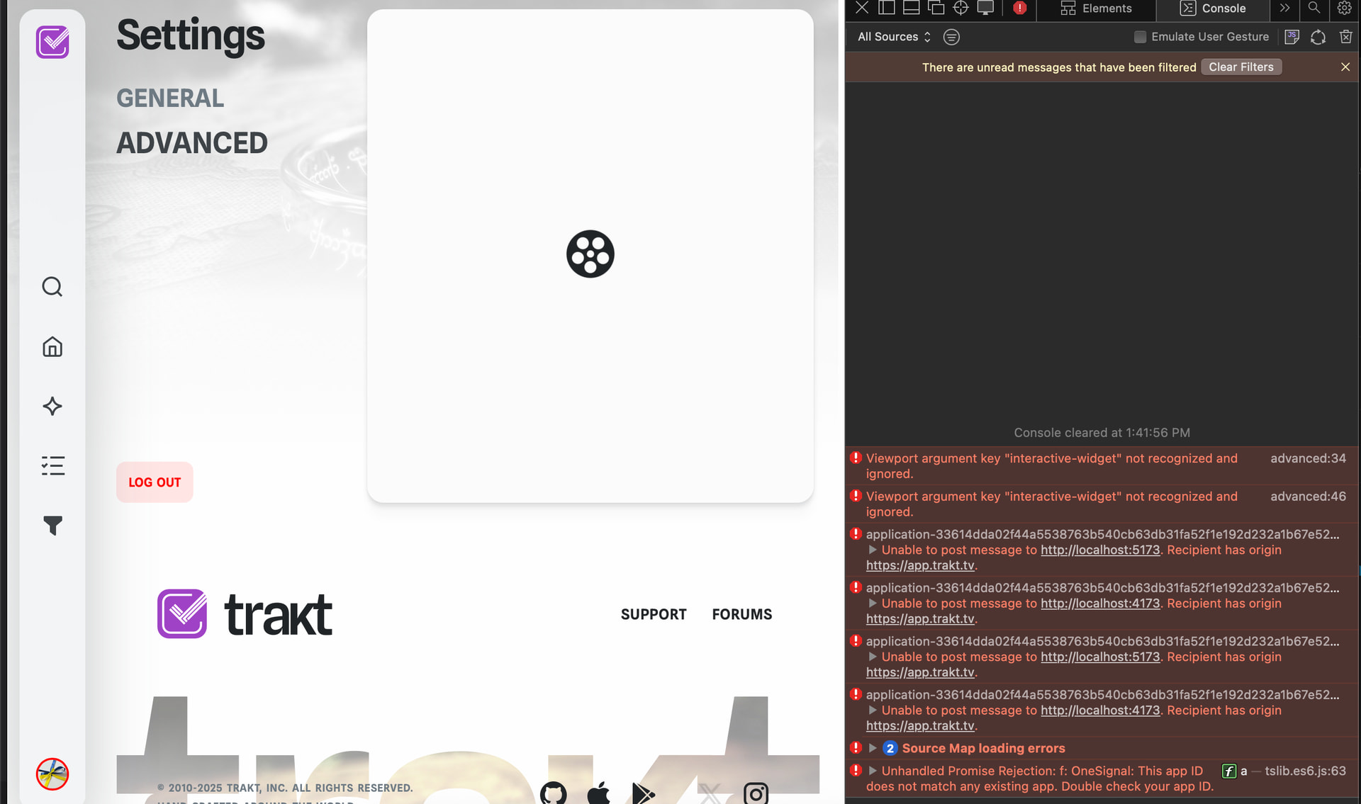
As for performance. It’s a great bit slower than normal Trakt. Especially when searching.

That’s all I could find on a first glance

In it’s current state there is no chance I can use the new website if it is forced on the users. I hope we get all the improvements necessary before the switch. It’s missing all the core features which makes Trakt incredible.

I use Chrome on my pc.

9 Likes

The new site is horrible. Where is my stuff? You know, the stuff that I’m interested in and that I pay to keep track of? Can’t find history, ratings, collection or anything. All I’m getting are recommendations and things other people are doing (if I actually followed anyone, which I don’t)

Also, horizontal scrolling is awful, especially in a desktop setting.

19 Likes

Why can’t we see user’s rating in comments section in 3.0 app version? That was totally fine and useful, now only useless likes are visible. Honestly and objectively it’s not getting better with every update. I’ve been with Trakt for 10 years, with recent things going on I’m starting to think to cancel VIP, however don’t really want to do this, because I’ve used to it so much.

5 Likes

I am shocked and stunned over this decision. Trakt is my favourite website – I absolutely love it – but the Lite version is almost the opposite. I still can’t find my history, which is why I primarily use Trakt. And since I only use Trakt on a laptop, it’s very frustrating to navigate the Lite site.

It’s really heartbreaking if you really are going to kill «the original» Trakt. I mean, use the VIP money I and others pay you and do whatever you want with the Lite version, but please let the original live. Please.

13 Likes

All of this :index_pointing_up:

2 Likes

I’m not sure if my experience sucks because I use Safari, or it’s just general quality.

:cross_mark: I can’t find a list of Dropped shows. It might be here though

:cross_mark: Filters on person page are missing. Use case for a product - I’m trying to watch every Jackie Chan movie and now it’s a mess of self/acting, I cannot even filter out watched stuff


:cross_mark: No Year in Review

:cross_mark: Month in review - now only previous one, I’m pretty sure there was an option to change it which is now gone. Not a big deal though. All time stats gone?

:cross_mark: WTF, give me back 1-10 option

:cross_mark: Filters ar very poor now. There are no country filter (though due to your 1 country limitation it’s almost always the US anyway), but it used to be possible to filter by language, studio, status


:cross_mark: I checked my native language for a few minutes, facepalmed heavily and not going there ever again.

9 Likes

What kind of profile is this?

If you’re like me and don’t use favourites or follow anyone, then your profile will be completely empty other than the monthly review at the top. A user’s profile should be showing ratings, comments, public lists, watch history and statistics.

13 Likes

1st time for me using the new UI on a Chrome browser (not Google) on a laptop. I like it! I’m probably what is considered a “old school” when it comes to UI, but usually Apple/Mac centric developers tend to be better at UI design, IME. Yours truly hasn’t tried the Android app on my Pixel. Is the beta worth a shot at this time? Thanks for the update, Kevin.

Thats so unfortunate, I signed up for VIP like yesterday. If this UI is final Ill guess we’ll wait for some alternatives to pop out of nowhere to fill this Trakt sized gap in our hearts.

8 Likes

Unfortunate to say my 5 years of VIP are done for, I was thinking of doing the 2 years, but I want features over UI.

If something works great, why do you need to go and re-design it entirely to be waaay different and without a lot of the useful features? I also found the toggle for spoilers, but I very much preferred the way classic does it, aka blurs it and you can click on it if you want to see.

The profile page does feel very very bare. Where’s the ratings or anything one has done on trakt previously?

10 Likes

And other issue. Whenever I mark something as ‘watched’ on the iOS app, it’s still showing in the calender for classic Trakt. (I have a filter to hide watched shows). The only way to fix it is to reset my data on the advanced settings everytime I look at it. I thought the whole idea of this is that everything all worked together
..

Unless they are co-ordinating their responses with @justin . It’s only just gone 9am in San Diego.

2 Likes

I am mainly an iOS app user and I took a look at the beta 3.0 build that was recently released on TestFlight. I was speechless when I saw how horrendous the changes were


What in the world happened! There are so many features missing I can’t believe this is the direction of the new redesign. The episode detail page is the biggest offense. The choice to show the series poster instead of individual thumbnails is awful because it makes it harder to differentiate between each episode. Putting everything other than the synopsis in a hidden tab that requires tapping an extra button is just terrible ux design. Why is the where to watch block taking up a whole section! If anything needs to be hidden it’s that.

Actors aren’t separated by season regular/guest stars anymore. Actor pages don’t show “from your history” section which is a huge downgrade for me since I use that all the time. When I see a familiar face in a show I want to know what previous series I recognize them from.

Can’t collapse comments anymore. Can’t scroll horizontally between episodes. Can’t click on writer or director names. Have to dig through two sub menus to add a note instead of just clicking one button. Horizontal scrolling is obnoxious for shows that have 20+ episodes per season. The vertical version was superior in every way.

Trying to view a season overview page is hilarious because the you have to long press the poster icon and select “Old” on the drop down list and it takes you to the legacy layout version :sob: like just give us an old option toggle for the entire app at this point.

I’m not even going to begin to get into all the mess of the website issues. My main focus is on the app because iOS doesn’t work like android or the web. We don’t have the option to downgrade or use an old link address to use the classic version. Once this build gets pushed to the main App Store that’s it. Of course there’s the ‘just don’t update your app’ type of response but that only works for so long. Until something breaks and an update is required to fix a bug, or a new feature comes out that I really want to use, or corporate decides to server side block older app versions and force users to update to the latest.

I’ve read through all the replies in this thread and I really hope management does the same and actually considers this feedback. NO ONE WANTS THIS. Users across all platforms are saying one way or another that these changes are downgrades. Stop trying to fix what’s not broken. As I read in another reply the purple icon rebrand really was the beginning of the end :frowning:

19 Likes

I fully agree with the things you said. I really don’t like that you can only see the series posters on each episode. And you can only see the series regular actor on episode and not the guest stars anymore.

And just like you i also used the “From your history” feature a lot. I hope they bring this feature back.

They should have waited with the update until it’s more polished and not like this, with half the features the userbase uses and pays for.

3 Likes

Honestly, I like most of this new UI in concept, it’s modern and clean

But it’s literally unusable currently


Literally none of the rows on any page have a arrow button to scroll the row (no matter how much you hover over the end of the row), meaning you can’t view anything off screen. For sections like the above, okay you just click the button to go to the full page with the vertical list, no big deal right?


Seasons and Episodes literally don’t have that button so you can only see as wide as your monitor (and keep in mind! I have a 21:9 ultrawide and this is fullscreened so I can see WAY more than most people), it’s literally impossible to view anything past a certain season/episode number to mark it as watched, how did this get released with such basic functionality broken

4 Likes